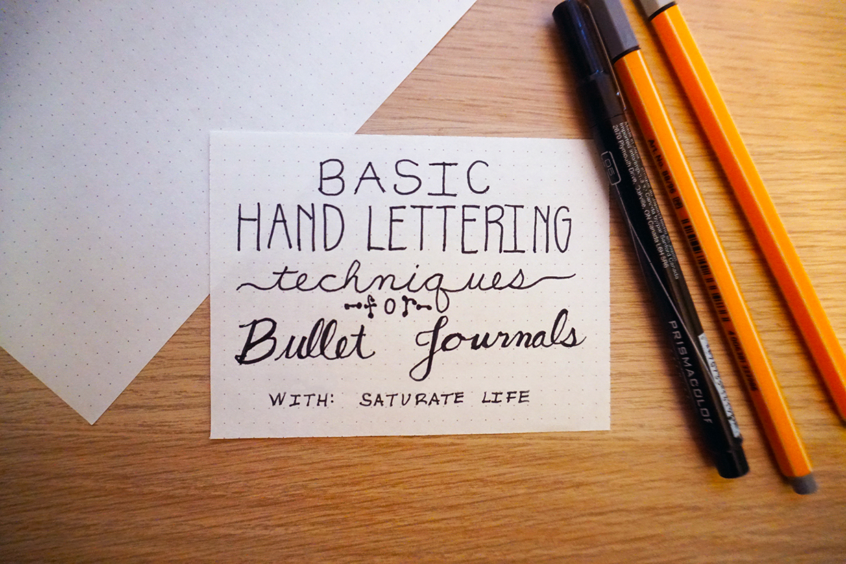
Hand lettering for a Bullet Journal is not as tricky as originally expected. Even with handwriting like a doctor or have a signature like my father (it eventually devolved into a spasm on a page) there are some really easy techniques to implement to create some beautiful hand-lettering script for your Bullet Journal.
If you haven’t heard of Bullet Journals, you’re in for a real treat. This is a method as developed by Ryder Carroll. As quoted from the website it is “an analog system for the digital age.” A simple method to combine lists, your daily planner, dreams, ideas, and plans. It is so versatile there is no real right or wrong way to curate your own journal. Take every guide more as a suggestion.
Once becoming obsessed with all the potential of what a Bullet Journal could be it’s easy to see all the beautiful pages and graphics art others have created and are showing off. Beautiful loopy calligraphy, neat straight lists, curvy arched titles. Gawd. Stupid beautiful graphics. I made a friend that helped as a muse for this post. Daniel Rauda is an inspiration for me with his technique. He is an enthusiastic artist from El Salvador who merges the art of literature with graphic design to create some impeccable works of art.
Daniel’s art and many other bullet journals seem impossibly out of reach and how did they make it look so perfect and effortless? His is a little out of our reach for even me but the basics are easier than they look. This guide for several types of lettering to help make the basic hand-lettering in your Bullet Journal beautiful and have incredible dimension.
1. Basic Hand Lettering
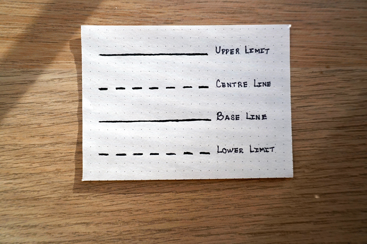
First let us go back to the basics of hand lettering, quite literally what was taught in elementary school. We have moved long past elementary, but for a moment we shall revert back so we get a solid grounding and terms. Remember back there were four basic lines for letters: The base line hand letters are built on, the centre line that divides the the tall letters in half and is the upper boundary of the shorter letters. The upper limit of all the letters where the capitals and the tall letters reach and the lower limit where the the letters that dip below the base line reach. These lines are all equal distance to keep the hand letters uniform.
There is no wiggle to the lines, they are straight and proud. Vertical lines are 90° or 45° to each other. Round letters all have the same radius. The width of each hand letter is as long as the distance to each of the vertical lines. Take a moment to remember those basics. Forget what is assumed for these hand lettering techniques. They were taught for reasons, like a beginner take time to make straight lines, perfect arcs and slow the hell down. I guarantee the reason why most hand lettering goes to crap is because people get rushed and throw the basics out the window for the sake of efficiency.
2. The Tall and Skinny Hand Lettering
Now we have established the basics of hand lettering we can play with it. For the first variation we will work with a style that works best with only uppercase, completely eliminating the need for the lower limit. For this hand lettering technique the centre line will move vertically up. This means that things that normally hit the centre line are pushed higher towards the top of the letter. The centre line of “E” where the loops of “B” meet or the cross of “X”. At the same time we want to keep the whole letter rather narrow. Thus tall and skinny.
3. The Short and Fat Hand Lettering
This is another one for all capitalization. This time we move the centre line down and all width becomes as wide as it is tall; or else even wider. This once again reverts letters into fitting into squares. By making everything wider than the standard ratio it appears short and fat. This hand lettering technique is best for short words, phrases, or connecting words like “the” “but” “with” etc.
4. Dotted Ends Hand Lettering
We go back to the basic ratio of lines for this hand lettering technique. However for the every end that has no intersection, where there is no intersection of the letter, cap it with a dot, or a line, or little dicks. Whatever seems appropriate. This style is great for both all-caps hand lettering or upper and lowercase letters. It’s all about capping the end of the letters while keeping everything uniform and round.
5. Cursive Hand Lettering
So begins the calligraphy, first with basic cursive. Once again slow down, rushing makes mistakes. Take the time to differentiate letters and re-learn the basics of the letters. Keep radii round and loops universal. I had a hard time with lower case ‘r’s. Mine always came out strange until I really slowed down and studied the shape of them.
6. Wide Cursive Hand Lettering
This works best with all undercase hand lettering. We take our standard cursive and from that point the letters will decrease in size of each letter and the space between the letters will increase. This makes a very delicate line of letters for a very airy appearance. I have even used to do differentiate different categories in my Bullet Journal instead of a literal line. When working with a phrase or a sentence I even remove the spaces, just making a longer line between the words.
7. Faux-ligraphy Hand Lettering.
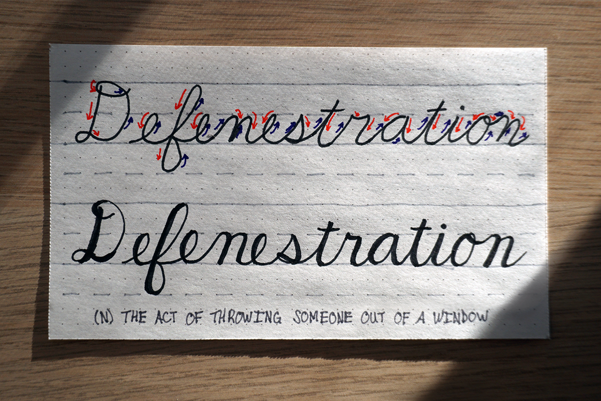
This is probably the most impressive hand lettering technique. There is no need to go out and purchase specialty pens for calligraphy hand lettering. For this take basic cursive and pay attention to how each letter is drawn and the way the letters are formed. Depending on the way the letter is drawn is where we will create the impression of the wider edge of the calligraphy pen. For every portion and side of the letter there is a downstroke have the the letter taper and widen, when the direction of the letter turns to any other direction thin out the letter again. This creates a really authentic looking calligraphy. From here it is easy to play with the base cursive to create different looks for the faux-ligraphy.
8. Bubble Letters
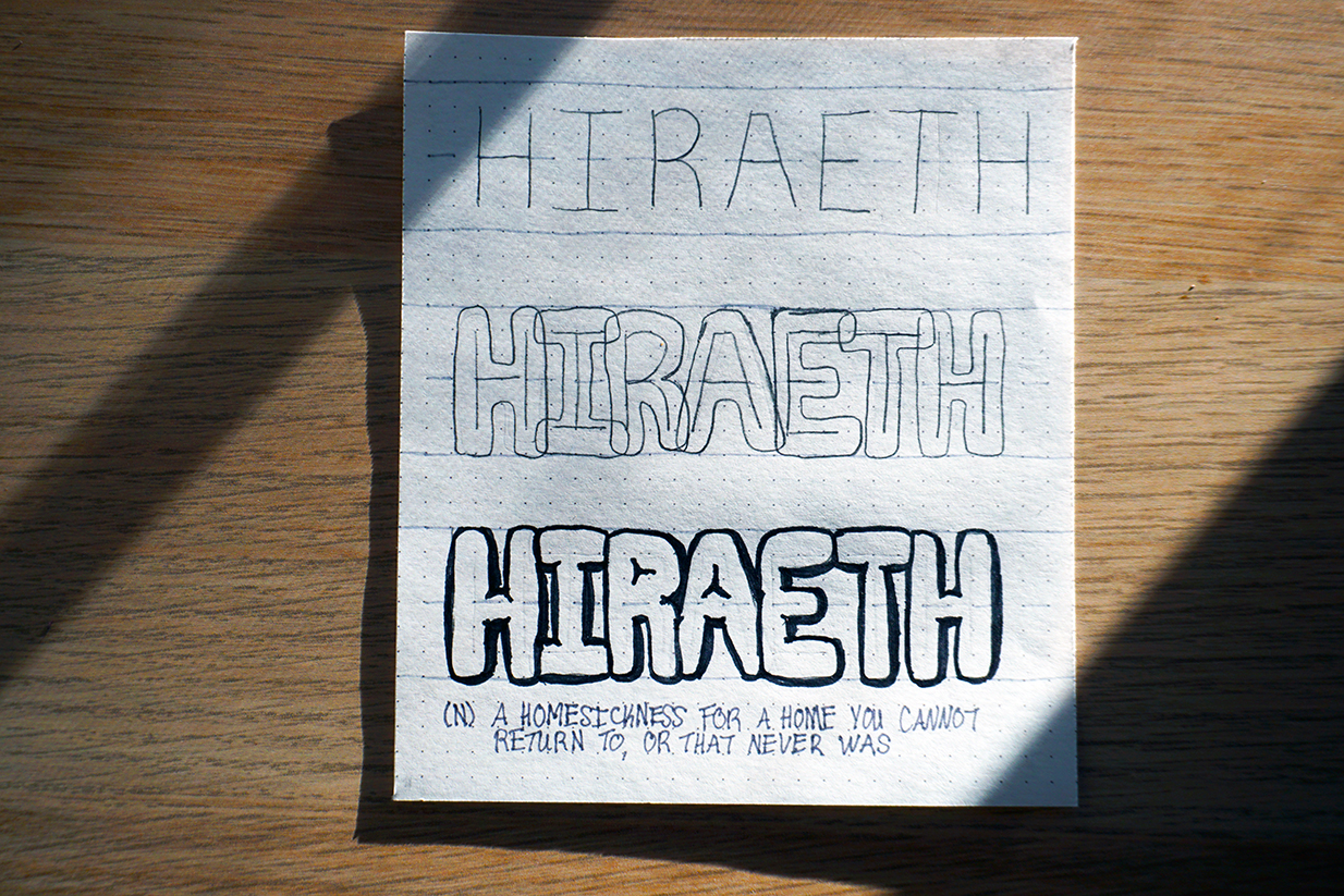
Bubble letters are so deceptively tricky. They look easy but then somehow for a long time whenever I would do them they would just look unnatural. They are honestly not as tricky as it looks, but it takes more steps. Take a pencil and write the word with more distance between each letter than normal. From there draw a curvy outline of each letter, the bubbles are supposed to overlap.
Erase the initial stick letter. From there take where the bubbles overlap and add tension between each letter. By that I mean, like balloons they will press against each other and push the other away, maybe with some bulging or creasing with the inflation. I like to add some puckering for the center of the letters with holes like As, Os, Rs, etc. When satisfied outline in pen and erase the pencil. For the best letters don’t skip any steps. It takes extra time, but overall it will be worth it for the quality of the letters.
Combinations
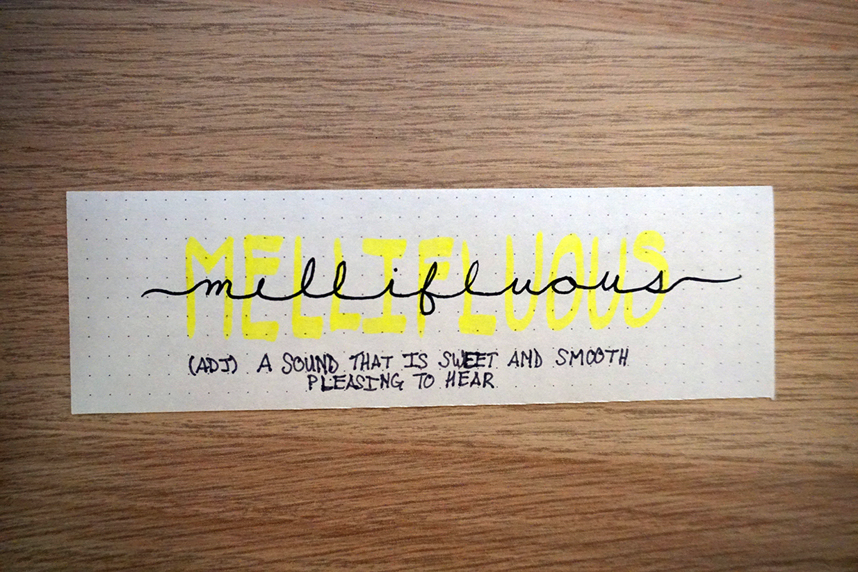
From here a neat thing to do is also layering different types of hand lettering. I love the effect of taking a highlighter and writing out in all caps then placing the wide cursive on top in the center. It can have the same message but since the mind will first read the dark letters before they get to the highlighter the highlighter could read as the second part of the message.
Mixing the faux calligraphy with the short and fat or tall and skinny creates some really nice dynamics and highlight specific words. However, I would not suggest mixing more than two, otherwise it looks silly. Take a look at the letters being drawn and see where smaller words can fit between letters that go down to the lower limit, or the upper limit. Play around with highlighting and coloring in bubble letters. These are some basic ideas to get you started but there are plenty more that are out there.
Thank you for visiting and I hope you are inspired by this tutorial on some basic hand lettering techniques for your Bullet Journal. Please email me what you have done with your hand lettering or some more ideas for hand lettering at saturatelife@gmail.com!
![]()